Earlier this month we attended BDI’s “Remarkable Trends Across Digital Design” webinar, and speaker Steven Louie of Flightpath had some useful tips for professional firms, especially those considering a website redesign. Steven hit three different topics: layout, visual design, and “moving forward.” Our top takeaways from each area are:
Much of the work that goes into that content gets lost if the content does not have the visual punch that draws readers into it and makes them feel good about sharing it.
1) Interface: Scrolling is the new black. Apparently, burying our heads in our smartphones all day has accustomed us to the act of scrolling. In fact, Steven noted that users find scrolling easier than clicking or tapping as a way of getting around a site. Web designers have picked up on this, and are now creating sites navigated primarily by scrolling (either up-and-down or side-to-side). Interestingly, the long scrolling format is no longer used just on website home pages, but also on specific product and service pages. Could you make your practice group pages more attractive by stacking relevant content (articles, bios, press releases) into one long page that can be scrolled?
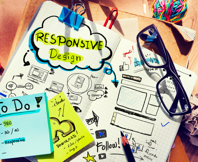
2) Visual: Go big and dynamic with your imagery. This is a message that professional firms cannot hear enough. Large, bold, stylized typography and images get attention—and can be done in a high-class manner. It’s a marked improvement from clichéd stock photography, which Steven notes invokes an unwanted sense of “fakeness.” Check out Charity Water’s website to see some big, bold images (and also the scrolling function noted above) done well.
3) “Moving forward”: This part of the presentation did not focus on web design so much as how to encourage sharing—something of particular importance to professional firms that produce a lot of content. The headline here is that content is more shareable when it is timely, has some sense of personality or humor (as appropriate to the topic, of course), and, finally, has compelling visuals. This last point is a valuable one for professional firms. My professionals invest a lot of time in producing client alerts, articles, and other content that, if shared, can help build their reputations and expand their networks. But much of the work that goes into that content gets lost if the content does not have the visual punch that draws readers into it and makes them feel good about sharing it. What imagery or other design elements can you add to your client alerts to give them that extra pop?
Three interesting points to chew on. Our thanks to BDI and Steven Louie for getting us thinking about these important topics.